Tuesday, November 5, 2013

What if we chose what Jesus chose?

Infographics are a type of project I particularly enjoy. I love the challenge of organizing information in a visually elegant way to communicate something. The weekly infographics I work on usually have some element of humor or fun, but once in a while I also get to work on more "serious" infographics.

Recently I worked with Marissa, who leads InterVarsity's Global Urban Trek program, to create an infographic that communicates the need for ministry in slum communities, the mission of what the Trek does, and the results of how God works through the Trek. The main message of the piece challenges readers to consider the life that Jesus chose - a life of poverty.

This was particularly energizing project to work on. Working with Marissa was great because she gave me freedom to use my design expertise (some clients can be a lot more picky and try to tell me how to design something, which isn't very helpful.) Marissa began by telling me her overall vision and hope for the piece, after which I did some of my own research and sketching. Our collaboration created something that both of us are very excited about. The hope is that this infographic will be useful both in recruiting students to the Trek, and also casting vision to potential financial ministry partners.

The color scheme uses the 'earthiest' tones in our color palette, but I also included blue for some brightness.

The printed version features an image of a slum community in Manila on the cover.

Wednesday, September 25, 2013

Partnering with Staff: Prayer Booklet

One of the things I love about my job is getting to work with other staff to create useful resources for campus ministry. Recently I teamed up with the staff at Ohio State University to design a prayer book for their students. This book contains guided morning, evening and night prayers, as well as helpful ways for students to combine personal with mission-focused prayer.

The original design was very simple (not bad at all, actually), but when the staff at Ohio State came to me asking for help, I was excited to improve upon what was already a great resource.

before and after - prayer booklet cover
One way I helped improve the design was to think about how the information in the booklet was organized and try to figure how to make it as easy to use as possible. In the original booklet, there is a Psalm-reading calendar chart that takes you through the entire book of Psalms three times in a year. The chart was three pages long and somewhere in the middle of the booklet.

original chart for Psalms reading
In my design process, I thought that if someone really wanted to access this chart on a daily basis, it would need to be easier to find and easier to read. So I decided to move it to the back of the booklet and consolidate it into one page.
my redesign of the Psalms reading chart
Additionally, I added a bolder header row and alternated the rows with white and gray so it would be easy to read across each line. All of these elements are what I hope to be improvements in making the chart easier to use.

What's great about this project is that I not only provided a service to the staff and students at Ohio State, but I also gave them a platform in making this resource more widely available. Since twentyonehundred has the means to order larger quantities of things, we decided to publicize the resource for others to use and make them available on our InterVarsity national online store. Within a couple months our first order of 1,000 ran out. We're now on our second print run and I've heard they're going fast!

Although I don't work directly with students, it excites me to know that my design work is helping them learn how to pray and practice it in their daily lives. I get to influence students to interact with God more regularly and more deeply. What a privilege!

Tuesday, September 3, 2013

A story about a blue cup

One of our biggest projects of the past few years was the Red Cup campaign, an evangelistic project that engages passersby with the question "What are you thirsty for?" and the familiar image of the red Solo cup used at many college parties. However, on some campuses and for some students, it's a blue cup that's impacting lives.

My friend Carole, on staff with InterVarsity's International Student Ministry at the University of Michigan recently included this story in her update:

"Last year, Carla stopped by our information table and picked up a blue cup. These cups have 'welcome' written on them in many languages. At the end of the year, Carla said 'something that really caught my attention about ICF was the blue cup... The fact that it had "SELAMAT DATANG" on it was one of the things that made me feel even more welcome, as in the first few days, some people I met didn’t even know where Indonesia was or what it was.' Carla was changed throughout the year and came to know God more, and her initial contact with us was a blue cup."

I'm thankful to see how my design work, in partnership with the work of staff on campuses, is transforming the lives of students!

Wednesday, July 17, 2013

Teaching Staff How to Communicate Effectively


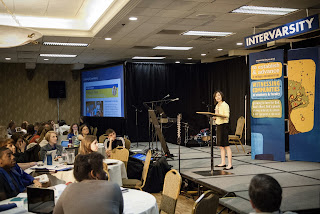
At our recent Orientation for New Staff Conference, I gave a presentation on creating effective ministry updates (ie: prayer letters).
 
I don't often get to do much teaching or public speaking these days so it was a good opportunity to interact with people in this way. As part of my presentation, I encouraged the new staff to make it a point to get someone to take pictures of them while they were up front teaching or leading. People who give and pray want to see them actually doing ministry.
 
While I was saying this, my coworker Adam got up and started taking pictures of me teaching! The one where he got behind me and snapped a photo of the audience was quite distracting, but turned into a cool shot. :)
 
Thank you for your prayers and gifts that allow me to in turn equip other staff to build ministry partners and support. You are impacting hundreds of staff as they live out God's call to reach students and faculty with the Gospel!

Tuesday, June 25, 2013

The Story of My Big News

So you may have heard: I'm engaged! Since I can't retell the story to everyone (I've already told it about 10 times), here's the story of how it happened!

When I left for work on that Wednesday morning (June 12), I noticed my roommate Amy was already gone. This is very unusual -- she almost always gets up later than me. My first thought was, she went to pick up Pat from the airport! I wasn't expecting Pat until that Saturday, but my suspicions about when he might propose made me guess that he could possibly show up early. However, there were no other clues indicating he was going to do that, I had just talked to him the night before.

So I checked Amy's desk when I got to work, and she wasn't there. I asked one of the interns passing by if he had seen her yet, and he replied, "I think she's picking someone up from the airport?"

I was right! Agghhh!!!!

But half an hour later I saw Amy and asked where she was. "Oh, I was having breakfast with my friend from church. It was a donor meeting and breakfast was the only time that would work."

Oh, makes sense. It seemed legit, and surely Amy would know better than some intern where she was! I believed her and went on with my day as usual, including my normal texting with Pat.

Little did I know, Amy had gone to pick him up, but his flight was delayed and so she had to go back to get him later in the afternoon. All the time I was texting Pat that day, he was just a few miles away!

Just before 5pm, my friend & office roommate Grete casually announced she was leaving early to get some reading done for her class. I thought nothing of it. Little did I know, she was leaving to go pick up Pat and bring him to my apartment. Amy was watching me from the room across my office to make sure I didn't leave too early, to give Pat enough time to get to our apartment and set up. They even instructed our intern to stall me in case it looked like I might leave early.

I went home around 5:45 as usual. I was not aware of anything that was going on with Grete or Amy or our intern.

When I opened the door, immediately I noticed the patio door was open, and I saw this standing on an easel out there.
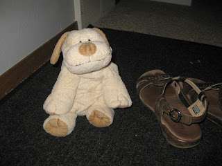
I vaguely processed that it was an infographic, but I was more focused on how odd it was that there was something outside on the porch. Then I looked down by my feet and I saw Plopper, my little stuffed animal dog that I had given Pat. That's when it really hit me, Pat is here!!! But where?!?!

I walked out to the porch thinking he might be hiding around the corner. I didn't see him, but I did see that my camera was sitting on the ledge, recording a video. The following few images are captures from that video.
I glanced at the poster but I needed to find Pat! So I went back inside and looked in my bedroom. I saw his shoes and backpack, but no Pat. He wasn't in my closet either, I checked.

As I came back out of my room, Pat emerged from the kitchen pantry! In the video, there is an audible yell from me.

Stupidly, the first thing that came out of my mouth was, "WHAT ARE YOU DOING HERE?!" Um, duh, Laura.

I gave Pat a hug, still totally in shock that he was standing in front of me. I had just talked to him 10 minutes ago and he had suggested we do a video chat that night. I had been picturing him far away in California. I couldn't process that he was right there in my kitchen!

Pat was eager for me to go back out to the porch, so we went back out and he made me look at the poster more carefully.
 
I still wasn't totally taking in what the infographic said. I kept holding Pat's hand and trying to hug him, but after a few moments he pulled away from me.

 
He got down on one knee (and then we were at about eye level, hahaha), pulled out the ring box, and said, "So...will you marry me Laura Li?" I think he said something else before that but I really don't remember. There was no long speech, which I think was good for both of us because it was pretty overwhelming. The rain was coming down really hard too so it was hard to hear anyway (you can't hear much on the video.)
Well, of course you know the ending: I said YES!

Later on, I finally got a better look at the infographic and saw the bottom line said, "Laura's answer to Pat's next question?" with a blank spot for me to write in. I enthusiasticlly wrote in my answer:

It was pouring so we had dinner near by at Saigon Noodles (I think it is becoming our favorite place) and spent the rest of the night recounting the day and talking to family and friends via phone/text. I think Pat did most of the talking because I was still in shock. Overall it was a great day. I was so happy to have that moment all to ourselves. :)

Oh yeah, here's the ring! (It's a dark blue sapphire, even though it looks black in the picture.)

I wanted to say thanks to my friends and Pat's accomplices - Amy, Grete (who designed the infographic) and Courtney (who printed and mounted it). It's only once in your life when you feel so loved because your friends lied to your face. :)

I can't wait to be married to Pat. He is a great man who loves Jesus passionately. He challenges me and empowers me to be who God made me to be. I'm thankful for how God has worked in both of our lives to bring us together.

Please pray for us as we prepare for marriage, and also as we transition to now living in the same city - something we are both excited about but are aware will need some time to adjust to. God has blessed us so much throughout our relationship already, I'm excited for what he has next for us!

Thursday, June 6, 2013

Visualizing Scripture

While cleaning up I was organizing all my manuscript study papers from months of team meetings. One thing I've begun doing is doodling little infographics on my pages that help me process ideas we are learning in that passage. It has been a fun, different way to engage in Scripture. Here are a few I redesigned for sharing with you all.


Thursday, May 30, 2013

Digging Deep: I-DIG

This spring I spent the majority of my time on this project, a discipleship group guide for International Student Ministry, named the "I-DIG". 
In the book's introduction, one of the authors refers to Jesus' parable about a treasure hidden in a field. From this parable and the aptly named title, "I-DIG," I decided to create a gardening theme as the main visual look of the entire book. This included garden-related icons for each section of the Bible study (Open = a sun, Dig In = a shovel, Respond = a watering can, and Dig Deeper = a shovel and pick axe), and various illustrations of leaves and plants for the chapter divider pages.
This book includes twelve chapters of fully-planned Bible studies, including the passages laid out in manuscript style and space to write comments and answers. There are also "tools" (another helpful garden-related word!) which are separate from the Bible studies but relate to understanding the Bible, interacting cross-culturally, and definitions of Christian words. The "Bible at a Glance" infographic which I posted earlier is included as one of the tools as well.

There is also a section that helps students learn how to share the Gospel using a diagram and script especially designed for international students who may be more likely to come from a shame/honor-based culture. This "Broken" diagram was created by International Student Ministries staff which I redesigned to appear here in the style of the I-DIG. Each step is shown using pencil and speech bubble icons so the reader knows in which order to draw and speak out the entire presentation.

The book, totaling 138 pages, took about four weeks to design! It was a lot of work but I'm excited knowing that I am helping hundreds of international students engage in Bible study and community, as well as provide a tool for students and staff to share the Gospel in a way that is relevant to internationals. Praying that God would use this book to impact many students for his kingdom!

Thursday, May 9, 2013

Creating my own stock photo

I just completed a project for Central Region's first Asian American student conference. Asian American designs sometimes prove a challenge for me--I want to give it a visual look that reads as "Asian" without being too stereotypical or cliché.

As I researched their theme, "Ohana," I discovered that the origin of the word comes from the root of the taro plant. The idea of roots, connectedness, and family all relate to the conference's theme. I decided I wanted to use images of taro roots as my main visual theme. Finding the right image was challenging. I had found one that I liked on iStockPhoto, but it would cost $70.
So yesterday I went to a local Asian grocery store and picked up a few taro roots, and this morning took a few photos on my window sill. I used the morning light to imitate the look of the original iStockPhoto.
I'm pretty happy with how it turned out, in fact I almost like my photo better than the stock photo. I get excited when I get to be creative and resourceful - in this case that meant saving $70 (and also having some taro to make something yummy out of later!)

Thursday, May 2, 2013

The Bible at a Glance

I recently redesigned this helpful "Bible at a Glance" chart, which gives an overview of the entire Bible, including a timeline, major characters and events, themes, and a list of all the books by category.

I worked with International Student Ministry to update this chart, and it will be included in the I-DIG (International Disciples Guide book) I designed for them, coming out in early June. 

I'm excited because this is a very useful tool in any context, especially with students who are learning about the Bible for the first time. I love being able to use my design skills to help students encounter Jesus through Scripture.


You can download this resource on our website. Original chart used by permission of InterVarsity Press.

Thursday, April 11, 2013

The illustration process.

Lately I've had a lot of opportunity to draw and illustrate. I've never felt very confident about my drawing, so it has been a step of faith to explore this area of creativity in my work.I thought you might be interested in seeing the process of how I get from the sketch to the final product.

When it comes to drawing people, I usually need a photo or some other model. Here, I found a photo of a woman in a similar pose from a photo shoot we did a few years ago. This helps me to know how the arms and legs should be bent, and give me a guide for proportions. However, you'll notice she looks pretty different otherwise. That's when I get to exercise creative license.


After the sketch is done, I trace it onto tracing paper with a Micron pen - this gives me a more defined line to work with when I bring it into the computer.

I use the traced image and scan it into the computer, increasing contrast so that the lines are opaque and clean.
Once the image is in the computer, I bring the file into Adobe Illustrator and use the "Image Trace" tool to convert it into vector lines. This allows me to easily make adjustments and clean up any errors in my tracing.

Once I'm satisfied, I start to add color and texture. For this particular illustration, I added a denim texture to her pants with a gradient fill, to make them look more realistic and add some interest. I also added a little bit of feathered color to her face so she looks rosy and happy. I chose the colors of her clothes and shoes carefully, communicating that she is trendy and conscious of student culture.


This piece was used as a printed insert for all the receipts that go out to our donors. So I added the text that was written for the piece, and a textured blue background to make the drawing stand out.

Here's the final product!


Monday, February 18, 2013

My Top 10 Favorite Projects in 2012

This year has been eventful in so many ways. In terms of my work and ministry, 2012 was the year I explored and developed new areas of creativity. Beyond my design work, I've had the chance to write, learn photography, and manage social media. It has been a wonderful opportunity to branch out and serve God in new ways.

Here are 10 projects I'm proud of from this past year:

10. Receipt insert illustration, September
Every month I design the receipt package that goes out to all our donors. Admittedly it is not my favorite project by any means. But in September I created this illustration for the insert, and it turned out to be pretty fun. I enjoyed the process of drawing the hands and the text, as well as creating the texture behind the image.

9. Illustration for InterVarsity blog, May (on intervarsity.org)
Illustration is another area of creativity in which I've had the chance to gain more skills through one of my ongoing projects - the InterVarsity blog. I enjoy the process of visualizing ideas that had only previously existed in words. This one I did in May was a fun one that I particularly enjoyed. I'm developing a particular style of drawing that I hope is fun and engaging to viewers/readers.


8. Campus photo shoot, June (original post)
During the summer I got a crash course in photography, running eight separate photo shoots over the course of eleven days! It was a great opportunity to develop my skills in photography, something I've enjoyed all year. I still have a lot to learn but I'm proud of the progress I've made.

this was one of my favorite shots from the photo shoot
I did on campus with several new staff posing as students

7. Urbana 12 Special Guest Invitation, June
I enjoyed this project because of the process of problem solving it entailed. Previously the reply card was a separate postcard that did not seem to have any connection to the actual invitation. By designing it as a perforated attached card that you could rip off and mail in, it kept the whole thing cohesive and elegant. I enjoy projects where I can use my creativity to solve problems, as well as make them look good!


6. Urbana 12 infographic "How to Raise Money to Get to Urbana," June (on Facebook)
This was the first of several infographics I designed to promote Urbana 12. I was excited because I not only designed it but was heavily involved in coming up with the ideas. I enjoyed creating each illustration and using the Urbana color palette to convey a light-hearted, fun tone to the piece. Humor is one of my favorite ways to communicate.
5. Books of the Bible pie chart infographic, April (on Facebook)
This simple infographic was our most popular of the year. The team meeting for this infographic was one of the most memorable, fun moments of the year.
4. Urbana 12 Conference Handbook, October (original post)
Despite the stress this project inevitably incurred, I am actually very proud of it. For Urbana 09's handbook, I began with a layout that another designer had started. But this time, I was able to create the entire handbook from scratch. I'm excited about the solutions I came up with for the various types of information that needed to be presented.

3. ONS infographic, June (on Facebook)
If you're counting, this is the fourth (out of 5) that uses the Urbana color palette, and the third (of 3) infographic on my list of favorite projects. I was especially excited that this infographic contains real (and interesting, in my opinion) data. This is the only infographic to date for which I have had to come in on a Saturday to complete. I'd like to say it was worth it, because I'm very pleased with how it looks.

2. "Singleness Sucks, Sometimes" blog post, October (on intervarsity.org)
I wrote three blog posts for the national InterVarsity blog in 2012. This one about my journey as a single woman was by far the most personal and significant. It became the year's fifth most read post in only a month! I've been truly enjoying the opportunity to communicate truth through my writing. I hope to continue this area of creativity and expression in 2013. 

1. Join-In Booklet for Urbana 12, November (original post)
Once in a while there is a project which really inspires me to create something really good. The Join-In Booklet for Urbana was my favorite piece of the year, and I'm apt to think it was because the cause was so important. Through this booklet I helped 16,000 Urbana participants join in assembling 32,000 medical kits, in partnership with caregivers in Swaziland, Africa.