
Sorry it has been so long since I have blogged! After sabbatical, I stepped into my role as Art Director and really since then have been immersed in birthing both a child as well as InterVarsity's new logo and brand! Needless to say, it's been an incredibly full couple of years. It's never too late to pick things back up, right?
 |
On August 20th, we officially launched our new logo and rebrand, along with InterVarsity's 2030 Calling. You can read more about our aim to see revival on campus and reach 2,500 campuses by the year 2030 here. (Maybe you can even get involved!)
As we've been preparing for this, the Design team has spent thousands of hours redesigning our logo and then creating dozens of communication pieces to support the new look. We've done research, gathered input from multiple audiences, had long discussions and countless meetings, and made iteration after iteration until we felt like we got it right.
 |
| My other baby this year - the new InterVarsity logo! (Our whole team did a lot of work and collaborated heavily to land on this design.) |
I realized that since we've been deep in this stuff, the new visual language feels like a natural progression to us, but to those not on the inside of the process, you may be wondering, what does it mean? Why did we change?
So I thought I'd say a little bit more about our process and highlight a few key elements of the logo.
What wasn't working

Our old logo was created around 2001, almost 20 years ago! At the time, we needed to show that InterVarsity was a credible and theologically-stable organization. As we've grown, however, it has become less necessary, because we're already a well-known ministry. At the same time, the logo was showing its age, as it did not work well in a square format, a key need for communicating on social media, and its corporate feel made us seem distant and unrelatable. Simultaneously, our organization has grown a lot since then and our branding strategy was more of a "frankenstein" approach rather than one that showed our unity and focus. We were a mish-mash, confusing mess. All those factors led us to the decision that we needed to rebrand and address those issues, as well as help launch the 2030 Calling.
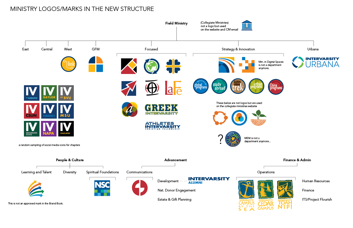 |
| A glance at our many ministry-specific logos... confusing right? |
Emphasizing what's important to us
After doing a lot of research and also some soul-searching, our team identified one really important aspect of InterVarsity's ministry that we knew we needed to communicate clearly–our love for God's Word. We're well-known for our quality training on Inductive Bible Study, and our deep commitment to living out the truth that we understand from scripture. Therefore, we've included a shape that represents the Bible in our mark, but in a more abstract, subtle way so as not to look too cliche.

Are you a sports organization?
We also wanted to make sure that our new look felt like we were a college ministry. Because our name doesn't easily translate to "campus ministry," we knew that we visually needed to say it more strongly. Our old logo/font had a sporty look, which made things even more confusing with the word "Varsity" in our name. So we chose a new font, called Gaspo Slab, a serif font that has a classic collegiate feel yet is still modern. I like to say, we're #nerdyANDhip.

Real Hope
Lastly, the big idea we want to communicate in our logo, as it represents who we are, is "real hope". We want students, and others, to experience the real hope that is only found in Christ whenever they encounter an InterVarsity group, event, book, etc. We've communicated that using an abstract arc shape, that represents light (a common metaphor for hope in Scripture), as well as the expansion and growth of God's kingdom.

Colors matter too
When it came to choosing a new color scheme, we wanted to move away from the dark, intense colors we had been using. Navy blue was flexible, but it often made everything feel dark and heavy. With the focus on communicating hopefulness, we chose brighter, lighter colors, that also communicate a vibrant, youthful energy. We are primarily a student ministry after all!

We've also been making use of more white space. Rather than filling every inch with text or pictures or solid color, we allow white space to create a welcoming look. Sort of like a messy, cluttered house can seem uninviting to guests, we felt that sometimes our visual look felt so full that we weren't inviting people to engage with us. So we're hoping that our informal, spacious look will help us be more approachable.
We're also introducing more gradients, which not only keeps us contemporary with current design trends, but also has a sense that the light is on the move. Our hope is not stagnant, it is growing, because God is at work!
An extra little something

During the process of our design work, we noticed something about the new mark that felt like a special added bonus. Maybe you've noticed it - the speech bubble shape that's in the negative space in the middle of the mark? This gave us the idea to use speech bubbles throughout our designs as a way of communicating the importance of relationship and community. InterVarsity is fundamentally about people meeting God through the context of friendships, mentorships, relationships. We felt like this extra feature of the new mark was a gift from God, as it strengthened the meaning and significance of our new logo.
 |
| Three new brochures, designed to coordinate with each other, featuring speech bubble designs. |
Additionally, we decided to use the Bible shape in our mark as a repeating visual element in a lot of our designs. This is another way of emphasizing our love for God's Word, and reminding others and ourselves that it's the foundation of all we do.
What it's really about
At the end of the day, what we really hope this new logo and visual look will do is unify and strengthen our impact on campus. We want InterVarsity to be recognized, appreciated, and effective as we reach more students and faculty, more campuses, and new corners of campus. We hope this new look will match the quality experiences people have on campus. It's been a long, exhausting journey, but I'm so proud of our work and so grateful that God sustained us during such an intense time. Maybe I'll share more about that in my next post!


No comments:
Post a Comment