Showing posts with label branding. Show all posts

Sunday, August 26, 2018

A new look for InterVarsity!

Sorry it has been so long since I have blogged! After sabbatical, I stepped into my role as Art Director and really since then have been immersed in birthing both a child as well as InterVarsity's new logo and brand! Needless to say, it's been an incredibly full couple of years. It's never too late to pick things back up, right?

Here's a picture of the child, just because. :)
On August 20th, we officially launched our new logo and rebrand, along with InterVarsity's 2030 Calling. You can read more about our aim to see revival on campus and reach 2,500 campuses by the year 2030 here. (Maybe you can even get involved!)

As we've been preparing for this, the Design team has spent thousands of hours redesigning our logo and then creating dozens of communication pieces to support the new look. We've done research, gathered input from multiple audiences, had long discussions and countless meetings, and made iteration after iteration until we felt like we got it right.
My other baby this year - the new InterVarsity logo! (Our whole team did a lot of work and collaborated heavily to land on this design.)
I realized that since we've been deep in this stuff, the new visual language feels like a natural progression to us, but to those not on the inside of the process, you may be wondering, what does it mean? Why did we change?

So I thought I'd say a little bit more about our process and highlight a few key elements of the logo.

What wasn't working


Our old logo was created around 2001, almost 20 years ago! At the time, we needed to show that InterVarsity was a credible and theologically-stable organization. As we've grown, however, it has become less necessary, because we're already a well-known ministry. At the same time, the logo was showing its age, as it did not work well in a square format, a key need for communicating on social media, and its corporate feel made us seem distant and unrelatable. Simultaneously, our organization has grown a lot since then and our branding strategy was more of a "frankenstein" approach rather than one that showed our unity and focus. We were a mish-mash, confusing mess. All those factors led us to the decision that we needed to rebrand and address those issues, as well as help launch the 2030 Calling.
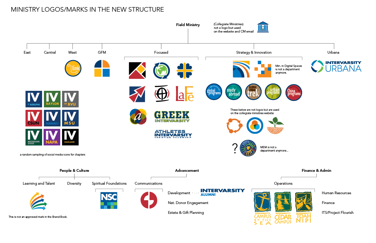
A glance at our many ministry-specific logos... confusing right?

Emphasizing what's important to us
After doing a lot of research and also some soul-searching, our team identified one really important aspect of InterVarsity's ministry that we knew we needed to communicate clearly–our love for God's Word. We're well-known for our quality training on Inductive Bible Study, and our deep commitment to living out the truth that we understand from scripture. Therefore, we've included a shape that represents the Bible in our mark, but in a more abstract, subtle way so as not to look too cliche.
Are you a sports organization?
We also wanted to make sure that our new look felt like we were a college ministry. Because our name doesn't easily translate to "campus ministry," we knew that we visually needed to say it more strongly. Our old logo/font had a sporty look, which made things even more confusing with the word "Varsity" in our name. So we chose a new font, called Gaspo Slab, a serif font that has a classic collegiate feel yet is still modern. I like to say, we're #nerdyANDhip. 

Real Hope
Lastly, the big idea we want to communicate in our logo, as it represents who we are, is "real hope". We want students, and others, to experience the real hope that is only found in Christ whenever they encounter an InterVarsity group, event, book, etc. We've communicated that using an abstract arc shape, that represents light (a common metaphor for hope in Scripture), as well as the expansion and growth of God's kingdom. 
Colors matter too
When it came to choosing a new color scheme, we wanted to move away from the dark, intense colors we had been using. Navy blue was flexible, but it often made everything feel dark and heavy. With the focus on communicating hopefulness, we chose brighter, lighter colors, that also communicate a vibrant, youthful energy. We are primarily a student ministry after all!

We've also been making use of more white space. Rather than filling every inch with text or pictures or solid color, we allow white space to create a welcoming look. Sort of like a messy, cluttered house can seem uninviting to guests, we felt that sometimes our visual look felt so full that we weren't inviting people to engage with us. So we're hoping that our informal, spacious look will help us be more approachable.

We're also introducing more gradients, which not only keeps us contemporary with current design trends, but also has a sense that the light is on the move. Our hope is not stagnant, it is growing, because God is at work!

An extra little something 
During the process of our design work, we noticed something about the new mark that felt like a special added bonus. Maybe you've noticed it - the speech bubble shape that's in the negative space in the middle of the mark? This gave us the idea to use speech bubbles throughout our designs as a way of communicating the importance of relationship and community. InterVarsity is fundamentally about people meeting God through the context of friendships, mentorships, relationships. We felt like this extra feature of the new mark was a gift from God, as it strengthened the meaning and significance of our new logo.

Three new brochures, designed to coordinate with each other, featuring speech bubble designs.
Additionally, we decided to use the Bible shape in our mark as a repeating visual element in a lot of our designs. This is another way of emphasizing our love for God's Word, and reminding others and ourselves that it's the foundation of all we do.

What it's really about
At the end of the day, what we really hope this new logo and visual look will do is unify and strengthen our impact on campus. We want InterVarsity to be recognized, appreciated, and effective as we reach more students and faculty, more campuses, and new corners of campus. We hope this new look will match the quality experiences people have on campus. It's been a long, exhausting journey, but I'm so proud of our work and so grateful that God sustained us during such an intense time. Maybe I'll share more about that in my next post!

Friday, July 17, 2015

The Elusive Brand Book

I've been wanting to share this for quite some time but I haven't felt like I was allowed to. Well, we're on the cusp of releasing an intitial working draft of the Brand Book, so I think it is safe to show you  a few sample pages! 
These pages help define the InterVarsity logo and the proper ways to use it. In my years of working as a designer for InterVarsity, I've seen all sorts of ways the logo has been used (or not used at all!). And it's no wonder, because we haven't done a very good job of helping people know how to use it properly! So these pages describe color, shape, spacing and placement. There are also a lot of examples of what NOT to do based on things I've seen. 
Other pages will help define our design guidelines for things like social media (square) images, email headers, website layouts, color palette, fonts, and a lot more! Seriously--I think it's going to end up being like 100 pages. Yikes. But, hopefully it will be a really helpful tool for our team and for our staff and students!

Tuesday, April 28, 2015

New Ministry Logos: Before & After

Remember those ministry logos I was redesigning? Finally, they have all been completed! Here are the final versions along with the old versions.

Black Campus Ministries (BCM):

Before:

 
As you can see, we are moving away from including words or acronyms in the mark and rather having the ministry name explicitly included underneath the InterVarsity logo. This works to better align the new logos with each other, as well as have a clear and consistent relationship with the InterVarsity logo.

Graduate & Faculty Ministries:
Before:

GFM previously had many different marks to label each of their separate ministries. For simplicity and consistency, we decided to create just one new mark for all of GFM's ministries.
 
For the GFM and ISM logos, we have also updated colors so that they are much more relevant to current color trends and stay in line with InterVarsity's brand of colors.
 
International Student Ministry:

Before:


Whether or not these are all the best decisions, I am not sure. But I do know that consistency and clarity are helpful in good communication, so that is what I am aiming to do!

Wednesday, March 11, 2015

Unsexy, but Important

Normally I like to share about projects I'm working on that are directly related to student ministry because it's easier to communicate how my job connects with transforming lives with the Gospel. However, over the past few months and in the coming months, there's one major project I'm working on that, well, in so many words, is unsexy.

A glimpse at my work flow for the new Black Campus Ministries logo


Branding
"Brand" is basically a person or group's reputation based on public opinion. It involves what people think about them or associate with them (high-class? fast? cheap? great quality?). When it comes to a company or organization like InterVarsity, a large part of how you inform the public and shape that brand is by your visual standards. Think about Coca-Cola, Apple, or Nike. Immediately you can picture their logo and products. That means they've got a strong brand that helps you associate certain values with their organization.

When it comes to a non-profit ministry, we don't necessarily have products, but we do have a mission along with a set of values that are integrated into everything we do for that mission. My job as a designer for InterVarsity is to help shape the way our brand is communicated visually - using logos, colors, fonts, specific layouts/proportions, etc.

Exciting huh? 
My progress on the new Graduate & Faculty Ministries
Why It Matters
Despite the decidedly unsexiness of my current work, I think it is very strategic and important to be developing a more cohesive and consistent brand for InterVarsity. Why? It helps the public associate what they see and hear with who we really are. And who we are is an organization committed to seeing students and faculty transformed by the Gospel. It's a compelling mission, but can get confused if we're not clear and consistent with how we communicate it. By using a better standard of visual design, we're making Jesus more accessible to the very people we are trying to reach. We are giving our alumni and ministry partners a clearer reason for continuing to partner with us. We're telling our story more effectively.
Work on the new International Student Ministries logo


So, despite the fact that I will never be able to directly connect my hours of work on logo design and template layouts to any measurable results of students coming to faith or ministry partners joining our ranks, I press on.

Thanks to all of you who have been a part of me getting to do this important, albeit unsexy, ministry work.


Wednesday, July 16, 2014

The Young People Get It!

Photo Credit: Melissa Montecuollo
As I have done for the past few years, I presented at our annual Orientation for New Staff conference (ONS) to talk about branding and design. This year, however, we introduced a new interactive component to the talk, giving new staff some time to create their own fake prayer letter using a variety of options (photos, captions, headlines, etc.).
Staff were given 3-4 options for each of these elements of a prayer letter,
then asked to choose 7-10 pieces and create their own pretend letter.
Photo Credit: Anna Maffety
After giving them a few minutes to work in groups, I led a time of debrief, giving an overview of some main principles of design and communication.
These were the four options for the header. Which one do you think works best?

What I learned from leading this new activity is that these young staff get it! As I debriefed with them, I found them to be very astute and intuitive about design, catching on to ideas of scan message, using the right colors and fonts, communicating visually through images and layout, and other important principles.
This is the moment in my presentation where I tell staff to have someone
take a picture of them while they're speaking. It always gets a good laugh.
Photo Credit: Anna Maffety
Each year as I teach this component at ONS, I'm finding that the new staff get it so much more quickly than a lot of older staff I work with. It makes sense, as these new staff are much more familiar with current culture trends like the use of visuals, social media, and shorter bits of communication rather than longer ones. It doesn't take much for me to sell "branding" to them because they totally get the value of good branding. It's encouraging to see things move this way, and I'm hopeful that this means my quest to brand InterVarsity well is in good hands with these "young'uns"!

Note: If you are interested in using this training tool with your staff, area, region, or students, please contact me!

Wednesday, March 5, 2014

Branding Dilemmas

I'm so sorry it's been a LONG time (four months!) since I have blogged. I got out of the rhythm when I was planning my wedding, and just have not stayed on top of everything since getting married!

I'm working on a number of various things but one larger, more nebulous project that's on my plate has been to work towards building a strong brand for InterVarsity. Branding involves a lot of things that go beyond just a good logo, but as a designer, I am focusing on the visual part of our brand, which does involve our logo and other visual markers of who we are.

To show the scope of what we are dealing with, I did a little research on social media to assess where InterVarsity was at with our brand. I grabbed the logos or images being used by all of our InterVarsity chapters all over the country. Then I compared that with the images being used by chapters of two other large campus ministries - Cru (formerly Campus Crusade for Christ) and the Navigators.

Here's what I found. (click on images to view bigger)

Cru:

Navigators:


InterVarsity:

As you can see, InterVarsity has the least consistency across our various chapters' presence on social media. Contrasting it with Cru, which has extremely consistent branding, and Navs, which is less consistent but at least has a recognizable shape/logo that exists across its chapters, I realize that our task is a large one. Something that's particularly challenging for us is that InterVarsity's logo is long and thin:

It is not conducive to the square shape that social media is moving towards. In fact, our current solution for the national InterVarsity Facebook and Twitter accounts is probably not super ideal:


So, I've got a big task ahead! Please pray that God would provide wisdom and insight into how to solve these issues, and that those who hold influence and power in our ministry would be on board with finding good solutions, allowing me to help increase our brand recognition, and hopefully as a result, our impact on campus.